
Website Development Cost in Turkey

In today’s digital age, having a strong online presence is crucial for businesses of all sizes. Turkey, with its rapidly growing tech industry and strategic location bridging Europe and Asia, has become an attractive destination for website development services. This article will explore the factors influencing website development costs in Turkey and provide insights into what businesses can expect when investing in their online presence. Cost Ranges for Different Website Types While prices can vary widely based on specific requirements, here are general cost ranges for different types of websites in Turkey: 1. Basic Informational Website: 5,000 – 15,000 Turkish Lira (TRY) These simple websites typically include a homepage, about us, services, and contact pages. They’re suitable for small businesses or personal use. 2. Small Business Website: 15,000 – 40,000 TRY More comprehensive than basic sites, these often include additional pages, basic SEO optimization, and simple interactive elements. 3. E-commerce Website: 40,000 – 150,000+ TRY Online stores require more complex functionality, including product catalogs, shopping carts, and secure payment gateways. Costs can increase significantly based on the number of products and custom features. 4. Custom Web Application: 100,000 – 500,000+ TRY Highly specialized websites or web-based software solutions with unique functionality can be the most expensive to develop. Hourly Rates vs. Project-Based Pricing Turkish web development agencies and freelancers typically offer two pricing models: 1. Hourly Rates: These can range from 150 to 750 TRY per hour, depending on the developer’s experience and expertise. 2. Project-Based Pricing: Many clients prefer this option as it provides a clear budget from the outset. However, it requires a well-defined project scope to be effective. Additional Costs to Consider When budgeting for website development in Turkey, keep in mind these potential additional costs: 1. Domain Registration: 100 – 500 TRY per year 2. Web Hosting: 500 – 5,000+ TRY per year, depending on traffic and resource needs 3. SSL Certificate: 300 – 2,000+ TRY per year 4. Ongoing Maintenance and Updates: Often charged at an hourly rate or as a monthly retainer 5. Content Creation: If you need professional copywriting or multimedia content Factors Affecting Website Development Costs Several key factors influence the cost of website development in Turkey: 1. Complexity and Scope: The complexity of your website is a primary cost determinant. A simple informational website will cost significantly less than a complex e-commerce platform or a custom web application. 2. Design Requirements: Custom designs, animations, and unique user interfaces increase development costs. Pre-made templates are more affordable but may limit customization options. 3. Functionality: Advanced features like user registration, payment gateways, booking systems, or integrations with third-party services add to the overall cost. 4. Content Management System (CMS): The choice of CMS (e.g., WordPress, Drupal, or a custom solution) affects both development time and cost. 5. Responsive Design: Ensuring your website functions well on various devices and screen sizes is essential but may increase development costs. 6. SEO Optimization: Implementing on-page SEO best practices during development can impact the final price. 7. Developer Expertise: Highly skilled developers typically charge more but can deliver higher quality results and work more efficiently. 8. Project Timeline: Rushed projects often come with premium pricing due to the need for additional resources or overtime work. Tips for Managing Website Development Costs in Turkey 1. Clear Project Scope: Clearly define your requirements before approaching developers to avoid costly changes mid-project. 2. Prioritize Features: Implement core functionality first and plan for future enhancements in phases to manage initial costs. 3. Consider Open-Source Solutions: Platforms like WordPress can significantly reduce development costs while offering extensive customization options. 4. Balance Quality and Cost: While it’s tempting to choose the lowest bidder, investing in quality development can save money in the long run by reducing maintenance and redesign needs. 5. Leverage Local Talent: Turkey has a growing pool of skilled developers who often charge less than their Western European or North American counterparts. 6. Negotiate Maintenance Contracts: Many agencies offer discounted rates for ongoing maintenance when bundled with the initial development project. The Turkish Web Development Market Turkey’s web development industry has been growing rapidly, driven by a young, tech-savvy population and increasing digital adoption among businesses. Major cities like Istanbul, Ankara, and Izmir are home to numerous web development agencies and freelancers catering to both local and international clients. The market is diverse, ranging from small boutique agencies specializing in niche industries to large, full-service digital marketing firms offering comprehensive web solutions. This competition has led to competitive pricing while maintaining high-quality standards. Turkey’s web development industry has experienced significant growth over the past decade, mirroring the country’s broader digital transformation. This expansion is driven by several key factors: 1.Young and Tech-Savvy Population: Turkey boasts a median age of around 32 years, with a large portion of its population being digital natives. This demographic trend has created a robust talent pool of developers and designers well-versed in the latest web technologies. 2. Increasing Digital Adoption: Turkish businesses across various sectors are increasingly recognizing the importance of a strong online presence. This has led to a surge in demand for web development services, from simple business websites to complex e-commerce platforms. 3. Startup Ecosystem: Turkey, particularly Istanbul, has emerged as a significant startup hub in the region. This vibrant ecosystem has fueled demand for innovative web solutions and fostered a culture of technological entrepreneurship. 4. Government Initiatives: The Turkish government has implemented various initiatives to support the growth of the IT sector, including tax incentives for R&D activities and programs to improve digital literacy. Conclusion Website development costs in Turkey can vary widely based on project requirements, chosen technologies, and developer expertise. While the country offers competitive rates compared to many Western markets, it’s crucial to focus on value rather than just the lowest price. A well-developed website is an investment in your business’s future, potentially driving growth and customer engagement for years to come. When embarking on a web development project in Turkey, take the time to research potential partners,
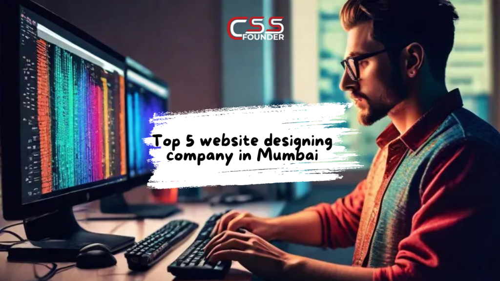
Top 5 Website Designing Companies in Mumbai
Introduction Overview of Mumbai’s Tech Scene Mumbai, often referred to as the financial capital of India, is also a burgeoning hub for technology and innovation. The city’s dynamic tech ecosystem is home to numerous startups, established IT firms, and creative agencies that drive digital transformation across various industries. Among these, website designing companies play a crucial role in helping businesses establish and enhance their online presence. Importance of Website Designing in Modern Business In today’s digital age, a well-designed website is more than just a digital brochure; it is a critical component of a company’s branding and customer engagement strategy. A professionally designed website can attract and retain customers, provide essential information, and drive conversions. With the rapid growth of e-commerce and online services, the demand for high-quality website design has never been higher. Criteria for Selecting Top Website Designing Companies Selecting the right website designing company in Mumbai involves evaluating several factors: CSS Founder Company Overview CSS Founder is a leading website designing company in Mumbai, known for its innovative and customer-centric approach. The company has established itself as a pioneer in web design, offering a range of services tailored to meet the diverse needs of its clients. Key Services Offered Notable Projects and Clients CSS Founder has worked with a variety of clients across different industries, delivering exceptional web design solutions that have helped businesses thrive online. Some of their notable projects include websites for major retail brands, educational institutions, and healthcare providers. Unique Selling Points Customer Testimonials Clients of CSS Founder have consistently praised the company for its professionalism, creativity, and commitment to delivering high-quality websites. Positive reviews highlight the company’s ability to understand client requirements and provide tailored solutions that exceed expectations. Industry Recognition and Awards CSS Founder has received several industry accolades for its outstanding work in web design, cementing its reputation as one of Mumbai’s top website designing companies. Contact Information Design Rush Company Overview Design Rush is a premier web design company in Mumbai, renowned for its creative solutions and strategic approach to web development. The company focuses on delivering exceptional user experiences through cutting-edge design and technology. Key Services Offered Notable Projects and Clients Design Rush has collaborated with a diverse range of clients, including startups, SMEs, and large enterprises. Their portfolio showcases successful projects for technology companies, fashion brands, and financial services firms. Unique Selling Points Customer Testimonials Clients have lauded Design Rush for its exceptional design skills, strategic insights, and ability to deliver projects on time and within budget. Testimonials emphasize the company’s dedication to client satisfaction and its role in driving business growth. Industry Recognition and Awards Design Rush has been recognized by various industry bodies for its excellence in web design and development, earning numerous awards for its innovative work. Contact Information The Manifest Company Overview The Manifest is a top-rated web design firm in Mumbai, known for its comprehensive approach to digital solutions. The company offers a wide range of services designed to help businesses achieve their online objectives. Key Services Offered Notable Projects and Clients The Manifest has delivered successful web projects for clients across various sectors, including hospitality, healthcare, and education. Their work includes visually stunning websites that drive user engagement and conversions. Unique Selling Points Customer Testimonials Clients appreciate The Manifest’s attention to detail, innovative design solutions, and ability to deliver projects that meet their specific needs. Positive reviews highlight the company’s professionalism and reliability. Industry Recognition and Awards The Manifest has garnered several awards for its excellence in web design and development, establishing itself as a leader in the industry. Contact Information Good Firms Company Overview Good Firms is a prominent website designing company in Mumbai, dedicated to delivering high-quality web solutions that drive business success. The company is known for its innovative approach and commitment to client satisfaction. Key Services Offered Notable Projects and Clients Good Firms has worked with a wide range of clients, from small businesses to large corporations. Their portfolio includes successful projects for retail, real estate, and healthcare industries. Unique Selling Points Customer Testimonials Clients have praised Good Firms for its creativity, technical expertise, and dedication to delivering high-quality websites. Testimonials highlight the company’s ability to understand client requirements and provide innovative solutions. Industry Recognition and Awards Good Firms has received numerous awards for its exceptional work in web design, underscoring its position as one of Mumbai’s top web design companies. Contact Information WebHopers Company Overview WebHopers is a leading web design company in Mumbai, known for its creative solutions and technical expertise. The company offers a comprehensive range of services aimed at enhancing online presence and driving business growth. Key Services Offered Notable Projects and Clients WebHopers has delivered successful projects for a variety of clients, including startups, SMEs, and large enterprises. Their portfolio includes innovative websites for fashion brands, tech companies, and service providers. Unique Selling Points Customer Testimonials Clients have commended WebHopers for its ability to deliver high-quality websites that meet their specific needs. Testimonials highlight the company’s creativity, technical prowess, and commitment to excellence. Industry Recognition and Awards WebHopers has earned several awards for its outstanding work in web design and digital marketing, establishing itself as a top player in the industry. Contact Information Conclusion Summary of Top Companies The top website designing companies in Mumbai—CSS Founder, Design Rush, The Manifest, Good Firms, and WebHopers—each offer unique strengths and services that cater to different business needs. These companies have demonstrated excellence in web design, innovation, and customer satisfaction. How to Choose the Right Company for Your Needs When choosing a website designing company, consider the following: Future Trends in Website Designing in Mumbai As technology evolves, website designing in Mumbai will continue to advance, with trends such as AI-driven design, augmented reality (AR) experiences, and enhanced mobile optimization shaping the future of web development. Companies that stay ahead of these trends will continue to lead the industry, providing innovative solutions that drive business growth and success.
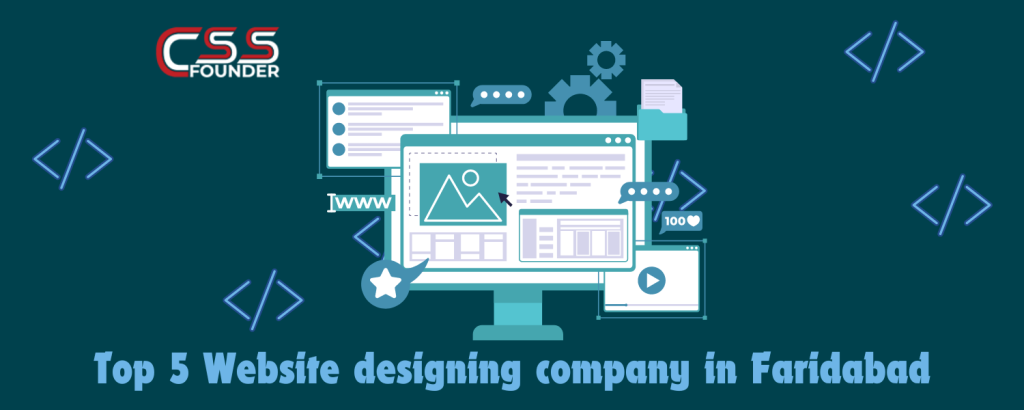
Top 5 Website designing company in Faridabad
Introduction In today’s digital age, a well-designed website is crucial for any business aiming to establish a strong online presence. Faridabad, an emerging city in India, has become a significant hub for website designing companies that offer a range of digital solutions to businesses. This article delves deep into the top 5 website designing companies in Faridabad: CSS Founder, Web Matriks, FutureGenApps, Creative Orion, and Agdova. We’ll explore their services, notable projects, technological expertise, and customer support to help you make an informed decision when choosing the right company for your web design needs. CSS Founder Overview CSS Founder is a leading website designing company in Faridabad, known for its innovative approach and commitment to delivering high-quality web solutions. Founded several years ago, the company has grown significantly, establishing a strong market presence and earning a reputation for excellence. Services Offered CSS Founder offers a comprehensive range of services to cater to various business needs. These include: Notable Projects CSS Founder has an impressive portfolio of projects that showcase their expertise and creativity. Notable projects include: Technological Expertise CSS Founder utilizes a variety of tools and technologies to deliver cutting-edge web solutions. Their technological expertise includes: Customer Support Customer satisfaction is a top priority for CSS Founder. They offer: Web Matriks Overview Web Matriks is a prominent web design company in Faridabad, known for its comprehensive digital marketing services and innovative web solutions. Established with the aim of helping businesses succeed online, Web Matriks has built a strong reputation for delivering results-driven solutions. Services Offered Web Matriks provides a wide range of services, including: Notable Projects Web Matriks has a diverse portfolio of successful projects. Some of their notable projects are: Technological Expertise Web Matriks leverages the latest technologies to deliver high-quality web solutions. Their expertise includes: Customer Support Web Matriks is committed to providing excellent customer support. Their services include: FutureGenApps Overview FutureGenApps is a fast-growing web design and development company in Faridabad, known for its innovative solutions and client-centric approach. The company was founded with a vision to empower businesses with cutting-edge digital solutions. Services Offered FutureGenApps offers a broad spectrum of services, including: Notable Projects FutureGenApps has successfully delivered numerous projects across different industries. Some highlights include: Technological Expertise FutureGenApps is proficient in a range of technologies, including: Customer Support FutureGenApps places a strong emphasis on customer support. Their offerings include: Creative Orion Overview Creative Orion is a well-established web design company in Faridabad, known for its creative and innovative approach to web design and branding. With a team of talented designers and developers, Creative Orion has built a reputation for delivering exceptional digital solutions. Services Offered Creative Orion offers a variety of services, including: Notable Projects Creative Orion has worked on several high-profile projects. Some of their notable projects include: Technological Expertise Creative Orion utilizes the latest tools and technologies to deliver top-notch web solutions. Their expertise includes: Customer Support Creative Orion is dedicated to providing excellent customer support. Their services include: Agdova Overview Agdova is a renowned web design and digital marketing company in Faridabad, known for its comprehensive web solutions and innovative approach. Founded with a mission to help businesses thrive online, Agdova has a strong track record of delivering successful projects. Services Offered Agdova provides a wide range of services, including: Notable Projects Agdova has an impressive portfolio of successful projects. Some of their notable projects are: Technological Expertise Agdova leverages the latest technologies to deliver high-quality web solutions. Their expertise includes: Customer Support Agdova is committed to providing excellent customer support. Their services include: Conclusion Choosing the right website designing company in Faridabad is crucial for establishing a strong online presence. Faridabad is home to several top-notch web design companies, each offering unique services and expertise. CSS Founder, Web Matriks, FutureGenApps, Creative Orion, and Agdova are among the best in the industry, providing comprehensive web solutions, innovative designs, and exceptional customer support. By understanding their offerings and strengths, businesses can make informed decisions to achieve their digital goals.
Boost Conversion Rates with These 7 CTA Best Practices

Creating effective call-to-action (CTA) buttons is a crucial aspect of web and app design, as they play a pivotal role in guiding users towards desired actions and driving conversions. However, designing CTAs that not only entice users to take action but also provide an inclusive and accessible experience for all can be a complex task. In this article, we’ll delve into how to boost conversion rates with these CTA best practices that strike the perfect balance between user experience, accessibility, and business goals. Contrast and Visibility Ensuring that your CTA buttons are highly visible and easily distinguishable is paramount for both user experience and accessibility. Utilize contrasting colors that make the CTA stand out from the surrounding elements on the page. A general rule of thumb is to maintain a minimum contrast ratio of 4.5:1 for normal text and 3:1 for larger text, as recommended by the Web Content Accessibility Guidelines (WCAG). Additionally, consider the color combinations you use, as certain types of color blindness, such as deuteranopia (green blindness) or protanopia (red blindness), can make it difficult to differentiate between specific shades. Conduct color blindness testing or use online tools to ensure your CTAs are visible to users with varying degrees of color vision deficiency. Clear and Concise Labeling The text on your CTA buttons should be clear, concise, and unambiguous, leaving no room for confusion or misinterpretation. Avoid using vague or confusing language that may leave users uncertain about the action they’re taking. Instead, use action-oriented language that explicitly conveys the purpose of the button, such as “Buy Now,” “Sign Up,” or “Download.” Additionally, consider the context in which the CTA appears and tailor the language accordingly. For example, a CTA on a pricing page may be more effective with a label like “Subscribe Now” or “Get Started,” while a CTA on a product page might be better suited with “Add to Cart” or “Buy Now.” Appropriate Size and Spacing CTA buttons should be large enough to be easily tapped or clicked, especially on mobile devices where users may be interacting with smaller screens and relying on touch input. Consider the size of the user’s fingers or assistive devices, such as styluses or mouth sticks, when determining the appropriate button size. Generally, a minimum button size of 44×44 pixels is recommended for touch targets on mobile devices. Additionally, ensure that there is sufficient spacing around the CTA to prevent accidental clicks or taps on adjacent elements. Maintain a comfortable padding around the button, and consider increasing the spacing for users with motor disabilities or those using assistive devices that may have difficulty with precise targeting. Logical Placement The placement of your CTA buttons can significantly impact the user experience and accessibility. Position CTAs in a logical and predictable manner, following the natural flow of the content and adhering to established design patterns. For example, primary CTAs should be placed in a prominent location, such as at the end of a product description or after a form submission. Additionally, ensure that CTAs are easily discoverable and not obscured by other elements on the page. Avoid placing important CTAs below the fold or in areas that may be easily missed by users, especially those who rely on assistive technologies like screen readers. Keyboard Accessibility Not all users rely on a mouse or touchscreen to navigate websites and apps. To cater to users with motor disabilities or those who prefer keyboard navigation, ensure that your CTA buttons are fully accessible via the keyboard. This means implementing proper focus management, allowing users to tab through interactive elements and activate CTAs with the Enter or Space key. Additionally, provide clear visual cues to indicate the currently focused element, such as an outline or a change in background color. This will help users with visual impairments or cognitive disabilities to easily identify the active element on the page. Alternative Text and Labels For users with visual impairments who rely on screen readers or other assistive technologies, providing alternative text and labels for your CTA buttons is essential. These descriptions should accurately convey the purpose and functionality of the button, allowing users to understand and interact with the CTA effectively. When crafting alternative text, be concise yet descriptive, and avoid redundant or irrelevant information. For example, instead of “Click the ‘Buy Now’ button,” use a more direct description like “Buy product now.” Additionally, ensure that the alternative text is consistently applied across all instances of the CTA on your website or app. User Testing and Feedback Continuously seek feedback from a diverse range of users, including those with disabilities, to ensure that your CTAs are meeting their needs and providing an optimal user experience. Conduct user testing sessions, gather analytics data, and actively listen to user feedback to identify areas for improvement and refine your CTA design and implementation. User testing can involve a variety of methods, such as usability studies, surveys, or interviews, and should include participants with varying abilities and assistive technology needs. Pay close attention to any issues or pain points reported by users, and prioritize addressing these concerns in your design iterations. By incorporating these best practices into your CTA design and implementation, you can create a more inclusive and accessible user experience for all users, regardless of their abilities or disabilities. Remember, accessibility is not just a legal requirement but also a moral obligation and a competitive advantage, as it allows you to reach a broader audience and provide a better overall experience for everyone.
12 Must-Have Website Design Requirements Checklist for Creating a Stunning Online Presence
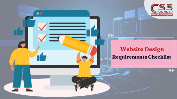
In the modern digital age, having a well-designed and functional website is essential for businesses of all sizes. Your website serves as a virtual storefront, a hub for information, and a platform for engaging with your target audience. However, creating an effective website requires careful planning and a comprehensive understanding of design requirements. To ensure your website meets your business objectives and provides an exceptional user experience, it’s crucial to have a detailed checklist of essential elements. In this blog , we shall discuss about website design requirement checklist for stunning online presence. Define Your Goals and Target Audience Before embarking on the website design journey, clearly define your goals and target audience. Are you aiming to generate leads, drive sales, establish an online presence, or a combination of these objectives? Understanding your goals will shape the overall design, functionality, and content strategy of your website. Additionally, identifying your target audience’s demographics, interests, and behaviors will enable you to tailor the website’s user experience accordingly. Conduct Competitor Analysis Researching your competitors’ websites can provide valuable insights into industry best practices, design trends, and potential areas for differentiation. Analyze what works well and what could be improved upon, as this information can inform your own design decisions and help you create a unique and compelling online presence. User Experience (UX) and Navigation A well-structured navigation system, intuitive layouts, and easy-to-use interfaces can significantly improve the overall user experience and increase engagement. Consider implementing features such as search functionality, breadcrumb trails, and clear calls-to-action to enhance usability and guide visitors through your website seamlessly. Responsive and Mobile-Friendly Design With the increasing use of mobile devices for internet browsing, it’s essential to ensure that your website is responsive and mobile-friendly. A responsive design automatically adjusts the layout and content to fit different screen sizes, providing a seamless and optimized experience across desktops, tablets, and smartphones. Content Strategy and Organization Content is the cornerstone of an effective website design. Organize your content in a logical and user-friendly manner, using clear headings, subheadings, and concise language. Additionally, incorporate multimedia elements such as images, videos, and infographics to enhance engagement and reinforce key messages. Search Engine Optimization (SEO) Optimize website according to latest google guidelines. Conduct keyword research, implement on-page optimization techniques (such as meta tags, alt text, and heading tags), and ensure that your website’s structure and content are search engine-friendly. Branding and Visual Identity Your website should be a visual representation of your brand. Incorporate your company’s color scheme, logo, and design elements consistently throughout the site. This consistency will reinforce brand recognition and create a cohesive user experience, enhancing brand loyalty and trust. Accessibility and Inclusivity Design your website with accessibility in mind to ensure that users with disabilities can effectively navigate and consume your content. Follow accessibility guidelines, such as providing alt text for images, ensuring proper color contrast, and enabling keyboard navigation. By prioritizing accessibility, you not only create an inclusive experience but also expand your potential audience. Security and Privacy Implement robust security measures to protect your website and users’ data from cyber threats. This includes securing your website with an SSL certificate, implementing secure payment gateways (if applicable), and adhering to data privacy regulations such as GDPR and CCPA. Building trust with your users through robust security and privacy measures is essential for long-term success. Analytics and Tracking Integrating analytics tools into your website will allow you to track user behaviour, measure website performance, and gather valuable insights. Use this data to continuously optimize your website and make informed decisions about design and content improvements, ensuring that your website remains relevant and effective. Maintenance and Updates Websites are not static entities; they require regular maintenance and updates to ensure optimal performance, security, and relevance. Plan for regular content updates, security patches, and software upgrades to keep your website in top shape and provide a seamless user experience. Testing and Quality Assurance Before launching your website, it’s essential to conduct thorough testing and quality assurance checks. Test your website across different browsers, devices to ensure consistent performance. Additionally, perform user testing to identify any usability issues and gather feedback for further improvements. By following this comprehensive website design requirements checklist, you’ll be well-equipped to create a website that not only looks visually appealing but also delivers an exceptional user experience, drives conversions, and supports your business goals. Remember, website design is an ongoing process that requires continuous evaluation and adaptation to stay ahead of the curve and meet the evolving needs of your target audience.
Elevate Your Brand With Expert Website Designing Process
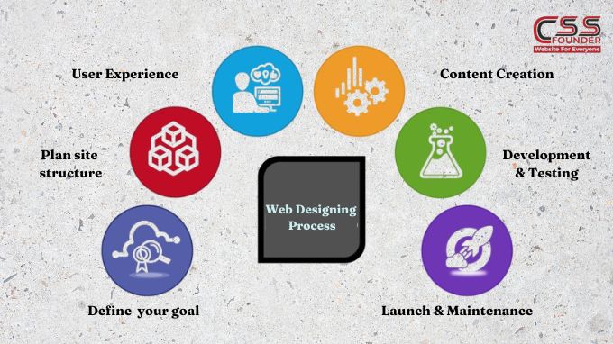
Elevate Your Brand With Expert Website Designing Process Building a website is a multi-faceted process that requires careful planning, creative vision, and technical expertise. Whether you’re creating a simple brochure site or a complex e-commerce platform, following a structured website design process can help ensure a successful outcome. In this article, we’ll walk through how to elevate your brand with expert website designing process Define Your Goals and Target Audience Before you begin the design phase, it’s crucial to have a clear understanding of your website’s objectives and the audience you’re trying to reach. Are you building an online portfolio, an e-commerce store, or an informational resource? Identifying your goals will shape the website’s structure, content, and overall user experience. Additionally, researching your target audience’s demographics, interests, and online behaviors will help you tailor the design and content to their preferences, making your website more engaging and effective. Plan Your Site Structure and Navigation Once you’ve defined your goals and target audience, it’s time to plan your site’s structure and navigation. This step involves creating a sitemap, which outlines the hierarchy of pages and how they’re interconnected. A well-organized sitemap ensures that visitors can easily find the information they’re looking for and navigate through your website without getting lost or frustrated. Design the User Experience (UX) User experience (UX) design is the process of creating a seamless, intuitive, and enjoyable experience for your website visitors. This involves several factors, including: Information Architecture: Organizing and structuring content in a logical and easy-to-understand way. User Interface (UI) Design: Creating visually appealing layouts, choosing color schemes, typography, and imagery that align with your brand identity. Usability: Ensuring that your website is easy to use, with intuitive navigation, clear calls-to-action, and responsive design for various devices. During the UX design phase, it’s essential to create wireframes and prototypes to visualize the website’s layout and functionality before diving into the visual design. Visual Design and Branding Once the UX design is finalized, it’s time to bring your website to life with visual design and branding elements. This step involves: Color Scheme: Choosing a color palette that reflects your brand personality and enhances the overall aesthetic appeal. Typography: Selecting fonts that are legible, consistent with your brand, and complementary to the design. Imagery and Graphics: Incorporating high-quality images, illustrations, icons, and other visual elements that support your content and brand messaging. Branding Elements: Integrating your logo, brand guidelines, and other visual assets to create a cohesive and recognizable brand experience. Content Creation and Optimization Content is the backbone of any website, and creating compelling, relevant, and optimized content is crucial for engaging your audience and achieving your goals. This step involves: Copywriting: Crafting clear, concise, and persuasive text that resonates with your target audience and supports your website’s objectives. Search Engine Optimization (SEO): Optimizing your content and website structure for better visibility and higher rankings in search engine results. Multimedia Integration: Incorporating videos, infographics, and other multimedia elements to enhance the user experience and convey information more effectively. Development and Testing With the design and content in place, it’s time to bring your website to life through coding and development. This stage involves: Front-end Development: Translating the visual design into HTML, CSS, and JavaScript to create the user interface. Back-end Development: Building the server-side functionality, integrating databases, and implementing features like e-commerce, forms, and user accounts. Testing and Quality Assurance: Thoroughly testing the website across different browsers, devices, and scenarios to identify and fix any bugs or issues before launch. Launch and Maintenance After rigorous testing and quality assurance, your website is finally ready for launch. However, the process doesn’t end there. Ongoing maintenance and optimization are essential to ensure your website remains relevant, secure, and up-to-date. This includes: Monitoring and Analytics: Tracking website performance, user behavior, and traffic sources to identify areas for improvement. Security and Updates: Implementing regular software updates and security patches to protect your website from vulnerabilities and cyber threats. Continuous Improvement: Regularly reviewing and enhancing your website based on user feedback, analytics data, and evolving trends and technologies. By following this comprehensive website design process, you can create a visually stunning, user-friendly, and effective online presence that meets your goals and exceeds your audience’s expectations.
Elevate Your Website Design with Parallax Scrolling in 2024
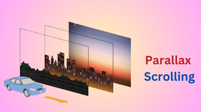
In the world of web design, creating a compelling and engaging user experience is crucial. With the ever-evolving landscape of technology, designers are constantly seeking innovative techniques to captivate their audience. One such technique that has gained significant traction in recent years is parallax scrolling. This visual effect, when implemented effectively, can enhance a website’s design and provide users with an immersive and memorable browsing experience. In this article, we shall discuss about how to elevate your website design with parallax scrolling. What is Parallax Scrolling? Parallax scrolling is a web design technique that creates a multi-layered scrolling effect, where background elements move at a different speed than foreground elements, creating a sense of depth and perspective. This effect mimics the way our eyes perceive objects at different distances in the real world, resulting in a more natural and visually appealing experience. Enhancing User Engagement One of the primary benefits of parallax scrolling is its ability to enhance user engagement. By introducing a sense of depth and movement, websites become more dynamic and interactive, capturing the user’s attention and encouraging them to explore further. This technique can be particularly effective for storytelling or highlighting key features, as it allows designers to guide the user’s focus and create a narrative flow. Creating Depth and Dimensionality Parallax scrolling adds an extra dimension to an otherwise flat website design. By utilizing multiple layers that move at varying speeds, designers can create a sense of depth and perspective, making the website feel more three-dimensional and immersive. This effect can be particularly powerful when combined with high-quality visuals, such as stunning photography or detailed illustrations, further enhancing the overall aesthetic appeal. Providing a Smooth Scrolling Experience One of the key advantages of parallax scrolling is its ability to provide a smooth and seamless scrolling experience. As users scroll through the content, the layered elements move in harmony, creating a fluid and visually pleasing transition. This smooth scrolling experience can contribute to a more enjoyable and engaging user journey, encouraging users to explore the website further. Highlighting Content and Storytelling Parallax scrolling can be an effective tool for highlighting specific content or conveying a narrative. By strategically placing elements on different layers and controlling their movement, designers can guide the user’s focus and create a storytelling experience. This technique is particularly useful for showcasing products, services, or brand stories in a visually compelling manner. Building Brand Identity and Memorability In today’s competitive digital landscape, standing out is crucial for businesses and brands. Parallax scrolling can help create a unique and memorable user experience that sets a website apart from its competitors. By incorporating this visually striking effect, brands can leave a lasting impression on their audience, contributing to brand recognition and recall. Responsive and Mobile-Friendly While parallax scrolling was initially designed for desktop experiences, modern web development techniques have made it possible to implement this effect seamlessly on mobile devices as well. With the rise of mobile usage, it’s essential for websites to be responsive and provide a consistent experience across various devices. Parallax scrolling, when implemented correctly, can enhance the mobile browsing experience and create a cohesive design across all platforms. However, it’s important to note that parallax scrolling should be used judiciously and in moderation. Overuse or improper implementation can lead to performance issues, slow load times, and a frustrating user experience. Designers should strike a balance between visual appeal and practicality, ensuring that the implementation of parallax scrolling enhances the overall user experience without compromising usability or accessibility. In conclusion, parallax scrolling is a powerful web design technique that offers numerous benefits, from enhancing user engagement and creating depth and dimensionality to providing a smooth scrolling experience and highlighting content in a visually compelling manner. When used effectively, it can help build brand identity, create memorable experiences, and set a website apart from competitors. As the web design landscape continues to evolve, techniques like parallax scrolling will play an increasingly important role in captivating and engaging audiences.
How The Content Management System Revolution is Changing the Game in Online Publishing in 2024
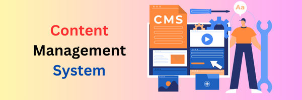
In today’s digital age, content is always the king. Whether you’re a business, blogger, or organization, having a strong online presence with a website full of fresh, relevant content is crucial. However, building and maintaining a website from scratch can be a complex and time-consuming process, requiring knowledge of coding, design, and web development. Content management systems (CMS), a game-changing technology that has revolutionized the way we create, manage, and publish content online. A CMS is a software application that simplifies the process of creating, editing, organizing, and publishing digital content, making it accessible to users of all technical skill levels. At its core, a CMS provides a user-friendly interface that separates the content from the website’s design and functionality. This means that you can focus on creating and managing your content without worrying about the technical aspects of web development. The CMS handles the behind-the-scenes complexities, allowing you to seamlessly publish your content to your website with just a few clicks. One of the key features of a CMS is its ability to manage multiple users and assign different roles and permissions. This feature is particularly useful for organizations or teams where multiple people contribute to the website’s content. Administrators can grant specific access levels, ensuring that only authorized users can create, edit, or publish content, maintaining control and consistency across the website. CMSs also offer a wide range of built-in features that streamline the content creation and management process. These features include: 1. WYSIWYG (What You See Is What You Get) editors: These user-friendly editors allow you to create and format content in a similar word processing-like interface, without having much of coding knowledge. 2. Content scheduling: With content scheduling, you can plan and schedule your content to be published at a specific date and time, ensuring a consistent flow of fresh content. Versioning allows you to track changes made to your content, making it easy to revert to previous versions if needed. 3. Media management: Most CMSs provide robust media management tools, allowing you to upload, organize, and embed various types of media, such as images, videos, and documents, into your content. 4. Search engine optimization (SEO) : Many CMSs come equipped with built-in SEO tools that help you optimize your content for better search engine visibility and ranking. 5. Template and theme management: CMSs offer a wide range of pre-designed templates and themes that allow you to quickly and easily customize the look and feel of your website without delving into complex coding. 6. Plugin and extension ecosystems: Most popular CMSs have extensive plugin and extension ecosystems, providing additional functionality and features to enhance your website’s capabilities. One of the most vital aspects of using a CMS is its scalability. As your website grows and your content requirements evolve, a CMS can easily adapt to accommodate your changing needs. Whether you’re running a small personal blog or a large corporate website, a CMS can handle the workload and provide the tools you need to manage your content effectively. Additionally, many CMSs are open-source, which means that their source code is freely available and can be modified and customized by developers to meet specific requirements. This open-source nature foster a vibrant community of developers who contribute to the continuous improvement and enhancement of these systems. Popular examples of CMSs include WordPress, Joomla, Drupal, and Adobe Experience Manager. While each CMS has its own unique features and strengths, they all share the common goal of empowering users to create, manage, and publish content with ease. In conclusion, content management systems have revolutionized the way we approach web content creation and management. By providing a user-friendly interface, powerful tools, and scalable solutions, CMSs have democratized the web, enabling individuals and organizations of all sizes to establish and maintain a professional online presence without extensive technical expertise. As the digital landscape continues to evolve, CMSs will undoubtedly play a pivotal role in shaping the future of content creation and management.
How To Make Your Website A Global Success

All businesses start from scratch, and they have to work hard to get to the top. In such a situation, having an online presence can create a big difference and this can happen through the development of an online website for your business. But there is one catch, that your website should be perfect to attract more customers to your business. You should keep in mind that you need to build a website that can perform well locally and in front of a global audience as well. This is so as it is possible for people to access your website globally, but it is not always true that they would enjoy it. Therefore, it is important to keep certain things in mind while building your website for the global audience as well. Given below are some tips that can help you keep your website at the global competitive level. Tips To Make Your Website Successful Globally 1. Translation Options Are Necessary A major thing for you to keep in mind is that English may be the language that is most commonly spoken in most countries, but some countries prefer to speak and communicate more in their native language. Thus, when you are trying to reach the entire population of the world, you need to make sure that your website can accurately translate your content into the many languages spoken all around the world. Through this method, you would be able to attract people from all around the world and this would increase your website’s popularity. 2. Keep Your Slangs Globally General A method through which you can generalize your readers is by not using any specific slang of a country. For example, the meaning of “sidewalk” in American English is the same as the meaning of “pavement” in British English. Thus, different countries can have different meanings for words and there are chances that such small differences in the language medium can confuse the customers when they visit your website. 3. Accept Their Local Methods Of Payment There are chances that your business website may get international visitors. If something interests them and if they want to purchase it, they need to pay you money. But if they do not have the proper means to do so, it can get problematic for you as you may lose a customer. Therefore, you must implement payment methods that can be supported by the global audience, such as PayPal or Skrill to receive payments. As I already told you that your website must be perfect on Google so that you can get more & more customers. To get the perfect website you must choose a website designing company in Delhi. Delhi can be the right city for you to get the best web design for your website.
What Does A Responsive Website Mean?
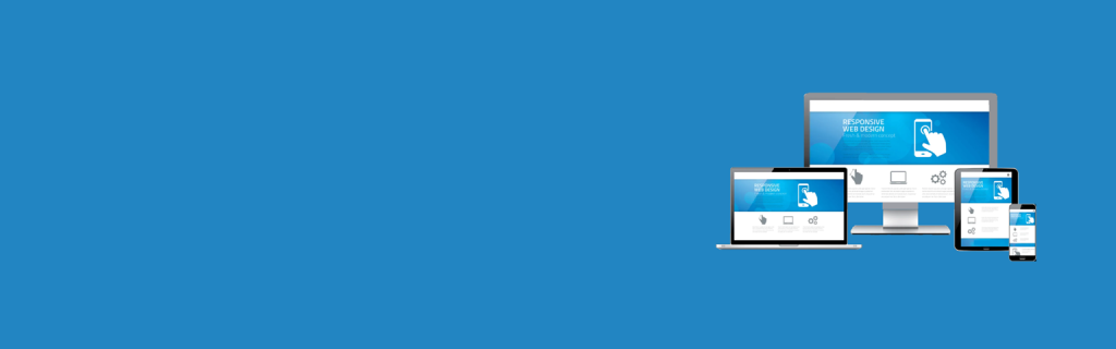
When a person thinks of expanding their business, doing the same by having a website built for them can prove to be beneficial in expanding the reach of your business to newer customers. Now, the website that you develop must be perfect and provide as many features as possible, as it would help in attracting more customers to your business. And one of the major features that your website should consist, is that it should be a responsive website. What Is A Responsive Website? A responsive website design, also referred to as an RWD design, portrays the form of a modern web design in which the website can render itself or its pages automatically according to the screens and devices on which it is being opened, such as laptops, mobile phones, tablets, et cetera. Basically, the website changes itself in a dynamic style to give a more user-friendly appearance to the users, according to the device on which they are opening the website. The functionality of the website depends on the device on which it is being seen and a responsive website improves the usability of the website by changing its layout according to the device’s screen size by simply shrinking it. Working Of A Responsive Website Design A responsive website works through the same HTML in ll different devices but uses different Cascading Style Sheets (CSS), which is responsible for the layout of your web page and uses different kinds of settings for your device’s screen size, orientation, colour capability, and other features of the device on which you are using the website. A website becomes responsive by reshuffling the elements of the web page according to the viewport. For example, a website desktop design may consist of three columns, but it may reshuffle to two columns in a tablet or even one column in your mobile smartphone. The responsive designs of your website are dependent on proportion-based grids for designing the elements and arranging the contents to present them in an optimized manner. Conclusion For you to provide an optimum user-friendly experience to your customers through your website, you should make it responsive so that everyone who visits your website, either through their tablets or mobile phones, or computers, can get the maximum out of your website and get an amazing experience. Along with this, your website team should also focus on details of content, design, and performance to provide a quality service to all your customers. You must choose the best website designing company in Mumbai, Delhi, Noida or you can choose other location which is suitable for you.


