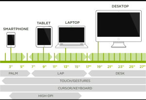
Responsive web design (RWD) is an approach to web development that ensures websites and web applications render well on a variety of devices and window or screen sizes. This means that whether a user is accessing a site on a desktop, tablet, or smartphone, the site will adapt its layout and functionality to provide an optimal viewing experience.
Responsive web design is essential in today’s multi-device world, ensuring that websites deliver a consistent and user-friendly experience across all screen sizes. CSS Founder, recognized as the best web design company in the USA, excels in creating responsive websites that enhance user engagement and satisfaction. Here, we delve into the detailed best practices for responsive web design, discussing their benefits, challenges, and key considerations.
1.Adopt a Mobile-First Approach
A mobile-first approach means you start by designing the mobile version of your website before creating versions for larger screens like tablets and desktops. This method ensures that the website’s main features and content work well on mobile devices, which typically have smaller screens and less processing power.
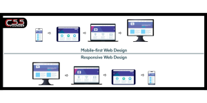
Advantages:
- Performance Optimization: Designing for mobile first naturally leads to better performance because it prioritizes essential content and functionality.
- SEO Benefits: Google uses mobile-first indexing, meaning it favors websites that are optimized for mobile, which can improve your search engine rankings.
- Enhanced User Experience: It ensures a smooth and easy-to-use experience for mobile users, who make up a large part of web traffic.
Challenges:
- Design Constraints: The limited screen space on mobile devices can make it difficult to include all the content and features you might want.
- Complex Scalability: Expanding the design from mobile to desktop can be complex and needs careful planning.
Key Considerations:
- Prioritize Essential Content and Features: Focus on the most important content and functionalities for the mobile version of your site.
- Progressive Enhancement: Gradually improve and enhance the design as you move to larger screens, ensuring that the user experience remains consistent and high quality.
2.Use Fluid Grid Layouts
Fluid grid layouts use relative units like percentages instead of fixed units like pixels. This allows the elements on a webpage to resize proportionally to the screen size, ensuring that the layout adjusts smoothly across different devices.
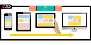
Advantages:
- Adaptability: Fluid grids automatically adjust to different screen sizes, maintaining a consistent layout regardless of the device.
- User Experience: They provide a seamless and visually appealing experience across all devices, enhancing the overall user experience.
Challenges:
- Complexity: Designing and implementing fluid grids can be more complex compared to fixed layouts.
- Browser Compatibility: Ensuring that fluid grids work consistently across all browsers can be challenging.
Key Considerations:
- Flexible Grid Layouts and Media Queries: Use a combination of flexible grid layouts and media queries to create a responsive design that adapts to different screen sizes.
- Testing: Test fluid grids across various devices and screen sizes to ensure consistency and functionality.
3. Implement Flexible Images
Flexible images are designed to resize within their containing elements, ensuring they do not overflow their boundaries and maintain their aspect ratios. This approach is crucial for responsive web design, as it allows images to adapt seamlessly to different screen sizes and resolutions. Techniques like setting max-width: 100%; in CSS ensure that images scale down appropriately without exceeding the dimensions of their containers, making the website look polished and professional across all devices.
Advantages
- Visual Consistency:
- Proportional Integrity: Flexible images maintain their aspect ratios, preventing distortion and ensuring they appear correctly regardless of the screen size.
- Unified Appearance: This consistency contributes to a cohesive visual experience for users, whether they are viewing the site on a mobile device, tablet, or desktop computer.
- Performance:
- Single Image Source: Reduces the need to load multiple versions of the same image for different devices, simplifying the design process and minimizing server requests.
- Dynamic Adjustment: Allows images to resize dynamically, which can help in managing how resources are loaded and displayed, potentially improving page load speeds and performance.
Challenges
- Load Times:
- High-Resolution Impact: High-resolution images can significantly increase load times, particularly on mobile devices with slower internet connections.
- Optimization Needs: Properly optimizing images to balance quality and performance is crucial to avoid negatively impacting user experience.
- Quality Management:
- Resolution Consistency: Ensuring that images maintain high quality across various resolutions and screen sizes can be difficult.
- Compression Artifacts: Over-compression to reduce file size can lead to visible artifacts, diminishing the visual appeal of images.
Key Considerations
- Responsive Image Techniques:
- Srcset Attribute: Use the srcset attribute in HTML to serve different image sizes based on device resolution and screen size. This allows the browser to choose the most appropriate image version, optimizing for both quality and performance.
- Picture Element: The <picture> element can also be used to provide multiple image sources and formats, offering greater control over which images are loaded on different devices.
- Image Optimization:
- Web Optimization: Optimize images for the web to reduce file sizes without significantly compromising quality. This involves techniques such as proper compression, using appropriate file formats (e.g., JPEG for photographs, PNG for graphics with transparency), and leveraging modern formats like WebP for better compression rates.
- Lazy Loading: Implement lazy loading to delay the loading of images until they are needed, which can improve initial page load times and enhance performance, especially on pages with many images.
4. Prioritize Touchscreen Compatibility
As touchscreen devices become increasingly prevalent, it is crucial to ensure that your website is touch-friendly. This involves designing larger, easily tappable buttons and ensuring adequate spacing between interactive elements. Making a website touch-compatible enhances the overall user experience, as it facilitates easier navigation and interaction on smartphones and tablets.
Advantages
- User Accessibility:
- Improved Usability: Larger and well-spaced touch targets improve accessibility, making it easier for users to interact with the website using their fingers.
- Inclusive Design: Touch-friendly design accommodates a broader range of users, including those with motor impairments.
- Engagement:
- Enhanced Interaction: By making interactive elements more accessible, users are more likely to engage with the website, leading to a more immersive experience.
- Reduced Frustration: Well-designed touch targets reduce the likelihood of accidental taps, leading to a smoother and more enjoyable user interaction.
Challenges
- Design Complexity:
- Aesthetic Balance: Creating a touch-friendly design while maintaining the overall aesthetic appeal of the website can be challenging.
- Space Management: Ensuring adequate spacing between elements without compromising the layout’s visual integrity requires careful planning and design.
- Responsive Feedback:
- Touch Feedback: Providing immediate and intuitive feedback for touch interactions is essential to guide users and confirm their actions.
- Performance: Ensuring that touch interactions are responsive and do not cause delays or lags can be technically demanding.
Key Considerations
- Interactive Element Size:
- Minimum Size: Design interactive elements, such as buttons and links, with a minimum size of 44×44 pixels as recommended by Apple. This size is generally considered large enough to be easily tapped without errors.
- Adequate Spacing: Ensure sufficient spacing between interactive elements to prevent accidental taps and to provide a comfortable touch experience.
- Visual Feedback:
- Touch Interactions: Provide visual feedback, such as color changes or animations, to indicate that an element has been tapped. This feedback helps users understand that their touch interaction has been recognized.
- Intuitive Design: Use design cues that guide users intuitively, making the touch interactions feel natural and seamless.
5. Optimize Typography for Readability
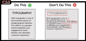
Readable text is crucial for user experience. Using scalable fonts and relative units like em or rem ensures that text adjusts appropriately across different devices. Additionally, adjusting line length, line height, and spacing is essential for maintaining readability on smaller screens.
Advantages
- Readability:
- Enhanced Legibility: Well-optimized typography enhances readability, reducing eye strain and making it easier for users to consume content.
- Improved Comprehension: Clear and readable text helps users better understand and engage with the content.
- Accessibility:
- Visual Impairments: Optimized typography improves accessibility for users with visual impairments by ensuring that text remains legible across various devices and screen sizes.
- Universal Design: Scalable fonts and appropriate spacing make the website more accessible to a diverse range of users.
Challenges
- Consistency:
- Cross-Device Consistency: Maintaining consistent typography across different devices and browsers can be challenging due to varying rendering engines and screen resolutions.
- Style Uniformity: Ensuring that the typography style remains uniform while adjusting for readability can be difficult.
- Design Harmony:
- Aesthetic Balance: Balancing readability with overall design aesthetics requires careful consideration of font choices, sizes, and spacing.
- Visual Appeal: Maintaining a visually appealing design while ensuring text readability can be challenging, especially on smaller screens.
Key Considerations
- Legible Fonts and Relative Units:
- Font Choice: Choose legible fonts that are easy to read on screens. Sans-serif fonts are often preferred for digital content due to their clean and straightforward appearance.
- Relative Units: Use relative units like em or rem for font sizing to ensure that text scales appropriately based on the device and user settings.
- Line Height and Spacing:
- Optimal Line Height: Adjust line height to ensure that text is easily readable without appearing too cramped or too spaced out. A general rule of thumb is to set line height to around 1.5 times the font size.
- Text Spacing: Adjust letter spacing and word spacing to enhance readability, particularly on smaller screens. Adequate spacing helps prevent text from appearing too dense or cluttered.
6. Utilize Media Queries
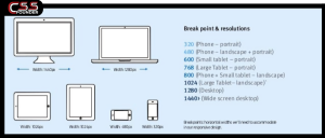
Media queries are a powerful CSS feature that allows you to apply different styles based on the characteristics of the user’s device, such as screen width, height, and orientation. They enable you to create responsive designs by defining breakpoints where the layout and styling of your website can adapt to provide an optimal viewing experience on various devices.
Advantages
- Customizability:
- Adaptable Designs: Media queries allow for highly customizable and adaptable designs, ensuring that your website looks and functions well on any device.
- Target Specific Devices: You can target specific devices or ranges of devices, applying styles that enhance usability and visual appeal for those particular contexts.
- Precision:
- Fine-Tuned Control: Media queries enable precise control over the appearance of the website, allowing you to tweak layouts, typography, and other design elements based on the screen size and device characteristics.
- Responsive Enhancements: They provide the ability to make responsive enhancements, such as adjusting font sizes, reordering content, and changing navigation styles to improve user experience.
Challenges
- Complexity:
- Management Difficulty: Writing and managing media queries can become complex, especially for large websites with many breakpoints and style adjustments.
- Maintenance Overhead: As your site grows and evolves, maintaining a large number of media queries can be challenging and time-consuming.
- Performance:
- Resource Intensive: Overuse of media queries can impact website performance, potentially leading to longer load times and increased processing requirements.
- Optimization Required: It is crucial to optimize media queries to ensure they do not degrade the performance of the website.
Key Considerations
- Define Clear Breakpoints:
- Common Device Sizes: Establish clear breakpoints based on common device sizes to ensure that your website adapts appropriately. Standard breakpoints include:
- 320px for smartphones
- 480px for small devices
- 768px for tablets
- 1024px for desktops
- Adaptive Design: Use these breakpoints to create adaptive designs that provide a good user experience across different screen sizes.
- Common Device Sizes: Establish clear breakpoints based on common device sizes to ensure that your website adapts appropriately. Standard breakpoints include:
- Organize Media Queries:
- Avoid Redundancy: Keep media queries organized to avoid redundancy and ensure that styles are not duplicated unnecessarily. Group related media queries together for better manageability.
- Modular Approach: Consider a modular approach to media queries, where each module or component has its own set of breakpoints, making it easier to manage and update.
- Performance Optimization:
- Efficient Use: Use media queries efficiently to minimize their impact on performance. Avoid excessive use and combine multiple queries where possible.
- Testing and Refinement: Regularly test your media queries on various devices and screen sizes to ensure they perform well and provide the intended user experience.
7. Leverage CSS Flexbox and Grid Layouts
CSS Flexbox and Grid Layouts are powerful tools for creating responsive designs. Flexbox is ideal for arranging items in a single dimension (either row or column), allowing for responsive alignment and distribution of space within a container. CSS Grid, on the other hand, provides a two-dimensional layout system, enabling more complex designs by defining both rows and columns.
Advantages
- Flexibility:
- Adaptable Layouts: Both Flexbox and Grid are highly flexible and adaptable to different screen sizes and orientations, making it easier to create responsive designs.
- Dynamic Adjustments: These tools allow for dynamic adjustments of layout elements, ensuring they fit well within the available space.
- Efficiency:
- Simplified CSS: Reduces the need for complex CSS, making the code cleaner and easier to manage.
- Enhanced Design Efficiency: Streamlines the process of designing and implementing layouts, allowing for quicker adjustments and iterations.
Challenges
- Learning Curve:
- Syntax and Properties: Requires a good understanding of Flexbox and Grid syntax and properties, which can be challenging for beginners.
- Advanced Techniques: Mastering advanced layout techniques with these tools can take time and practice.
- Browser Support:
- Compatibility Issues: Ensuring compatibility with older browsers that may not fully support Flexbox or Grid can be challenging.
- Fallbacks: Developing fallbacks for browsers with limited support adds complexity to the design process.
Key Considerations
- Appropriate Use Cases:
- Flexbox: Use Flexbox for one-dimensional layouts, such as navigation bars, where elements are arranged in a single row or column.
- Grid: Use Grid for two-dimensional layouts, such as entire web pages, where both rows and columns need to be defined.
- Cross-Browser Testing:
- Compatibility Testing: Test layouts across various browsers to ensure compatibility and a consistent user experience.
- Fallback Strategies: Implement fallback strategies for older browsers to maintain functionality and appearance.
8. Test Across Multiple Devices
Testing is critical to ensure your responsive design works as intended. Utilize tools like Chrome DevTools, BrowserStack, or physical devices to test your website across various screen sizes and browsers.
Advantages
- Quality Assurance:
- Consistency: Ensures a consistent and high-quality user experience across all devices.
- Reliability: Helps identify and fix issues early in the development process, reducing the risk of post-launch problems.
- Bug Identification:
- Early Detection: Helps identify bugs and layout issues that may not be apparent in the development environment.
- Comprehensive Coverage: Ensures that all potential issues are addressed, improving overall site stability.
Challenges
- Resource Intensive:
- Device Access: Requires access to multiple devices and browsers, which can be resource-intensive.
- Testing Infrastructure: Setting up and maintaining a comprehensive testing infrastructure can be costly.
- Time Consuming:
- Thorough Testing: Thorough testing can be time-consuming, especially for complex websites with many interactive elements.
- Iteration Cycles: Multiple testing and iteration cycles are often needed to catch and resolve all issues.
Key Considerations
- Regular Testing:
- Development Process: Regularly test your website during the development process to catch issues early and ensure ongoing compatibility.
- Automated Testing: Consider using automated testing tools to streamline the testing process and reduce manual effort.
- Combination of Tools:
- Emulators and Real Devices: Use a combination of emulators and real devices for comprehensive testing, ensuring that the website performs well across different environments.
- Cross-Browser Tools: Utilize cross-browser testing tools to verify compatibility across various browser versions and platforms.
9. Optimize Performance
Performance optimization is key to responsive web design. Techniques such as lazy loading, optimizing images, and minifying CSS and JavaScript can significantly improve load times, especially on mobile devices with slower connections.
Advantages
- Faster Load Times:
- Enhanced User Experience: Reduces load times, enhancing user experience by providing quicker access to content.
- Reduced Bounce Rates: Faster load times can lead to lower bounce rates and higher user engagement.
- SEO Benefits:
- Search Engine Rankings: Improves search engine rankings as performance is a key factor in SEO.
- Visibility: Better performance can increase the visibility and reach of your website.
Challenges
- Technical Complexity:
- Implementation Knowledge: Requires technical knowledge to implement performance optimization techniques effectively.
- Best Practices: Staying updated with the latest best practices and tools for optimization can be challenging.
- Maintenance:
- Continuous Monitoring: Requires continuous monitoring and optimization to maintain performance.
- Resource Allocation: Allocating resources for ongoing performance management can be challenging for smaller teams.
Key Considerations
- Lazy Loading:
- Deferring Non-Critical Resources: Implement lazy loading to defer the loading of non-critical resources, improving initial page load times.
- User Interaction: Ensure that lazy-loaded content appears seamlessly as users interact with the page.
- Image Optimization:
- Compression: Optimize images using compression techniques to reduce file sizes without compromising quality.
- Modern Formats: Use modern image formats like WebP for better compression rates and performance.
- Minification:
- CSS and JavaScript: Minify CSS and JavaScript files to reduce file sizes and improve load times.
- Build Tools: Utilize build tools and workflows to automate the minification process during development.
10. Continuous Improvement
The digital landscape is constantly evolving, so continuous improvement is essential. Regularly update your design to accommodate new devices, browser updates, and user feedback. Staying current with the latest web design trends and technologies ensures your website remains relevant and competitive.
Advantages
- Relevance:
- Up-to-Date Design: Keeps your website up-to-date with the latest trends and technologies, ensuring it meets current user expectations.
- Competitive Edge: Regular updates help maintain a competitive edge in a rapidly evolving digital landscape.
- User Satisfaction:
- Feedback Integration: Enhances user satisfaction by addressing feedback and improving the user experience.
- Adaptability: Ensures that your website continues to meet the needs of its users as their preferences and behaviors change.
Challenges
- Ongoing Effort:
- Resource Allocation: Requires continuous effort and resources to stay updated and make necessary improvements.
- Prioritization: Balancing ongoing improvements with other business priorities can be challenging.
- Adaptability:
- New Technologies: Adapting to new technologies and trends can be challenging and may require rethinking existing design and development practices.
- Skill Development: Continuous improvement may necessitate ongoing skill development and training for your team.
Key Considerations
- Regular Review:
- User Feedback: Regularly review and update your website design based on user feedback and industry trends.
- Analytics: Use analytics to identify areas for improvement and track the impact of updates.
- Resource Allocation:
- Maintenance Budget: Allocate resources for ongoing maintenance and improvements, ensuring that your website remains performant and up-to-date.
- Dedicated Team: Consider having a dedicated team or resources focused on continuous improvement and staying current with web design best practices.
Conclusion
Implementing these best practices for responsive web design can significantly enhance the user experience and improve your website’s performance. CSS Founder, the best web design company in the USA, exemplifies these strategies in their responsive web designs, ensuring that their clients’ websites are visually appealing, functional, and accessible across all devices. By embracing these practices, you can create a responsive website that meets the needs of today’s diverse internet users, driving engagement and success for your business.
